Plots
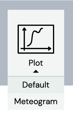
MetX can also visualise weather data through the plot function. When adding a new tab or changing the Tab Layout to more panels, click on ”Add Plot” and choose the "Default" Plot option.

The default adjustments include an overview of the 2m temperature over the following 7 days.


In the panel banner on the top right, the user can change the title of the chart, select a date-time range and change the location for which weather data is displayed. The chart title is changed by clicking on ”New Title” and typing into the blank field that appears. The user can select a specific date and time with the time navigation in the panel banner to get a timeseries of the following 7 days of the selected date or the user can define a date-time range by changing the start and end dates on the calendar or in the input boxes.


Changing the date-time range leads to an output like the following:


Directly beside the ”Date-Time range”, the location can be modified by clicking on the location icon or the longitude/latitude coordinates. A small window opens, where the user is able to enter latitude/longitude or a specific address. Below the location information in the layer stack, the ”Style” options enable the user to modify the appearance of the plot title and legend.


Within the layer stack, the user can also change the appearance of the parameter shown in the plot. Model source, parameter, format, unit, and level can be adjusted. In addition you can change the color, series type, line type and the Y-Axis scale.
The ”Thresholds” section adds an additional color based on a threshold, which can be determined by the user. For example, if the 2m temperature rises above 10 degrees Celsius, the temperature line can be highlighted green. Additionally, if the 2m temperature falls below 5 degrees Celsius, the temperature line can be highlighted red. To do this, check the "High" and/or the ”Low” box, set the thresholds and choose their respective colors. The user can add up to 2 thresholds.


Plots can display multiple parameters on the same axes. This can be done by clicking on ”Add Layer” at the bottom right of the layer stack. Here, each parameter can be adjusted with its own style and thresholds.


If the ”Source” is set to an ensemble model such as ECMWF ENS, the displayed band (an indication of the uncertainty in the forecast) and line can be adjusted under ”Ens Members” button. For example, the 40% band can be displayed with the mean.

